As the Vice President (2019–21) of my local chapter of AIGA, the professional association for design, I was intimately familiar with the shortcomings of our website from the backend. I completed a usability study as part of my graduate work in UX at a time the board was considering an overhaul of the website. The study revealed several critical and major issues with the site which were not on my radar. The findings were passed on to my executive board to help inform the website redesign that was completed in 2021.
Highlights
User research
Personas
User stories
High fidelity prototype
User testing
Tools
Adobe XD
Google Forms
Qualtrics Survey
Zoom
Due to my experience with the website and deep knowledge of the organization, I had many hypotheses on what would improve the user experience. Interviewing members of our target audience and completing user tests validated my hypotheses and revealed additional areas of opportunity. I delved in to fully understand the lay of the land including the organization’s goals, user goals and user and organizational pain points. My research culminated in a high fidelity prototype of the redesigned website which was user tested. My prototype performed 50% better than the existing site with all users successfully completing tasks and responding favorably to the new experience.
Overview
As a volunteer board member, I had access to and a deep understanding of AIGA Arizona as an organization. I knew a website redesign was being planned by the board so I took advantage of my graduate assignment to have a positive, real-world impact. This allowed me to have access to better data and background information for my assignment as well as to contribute to my community. My UX research included:
- stakeholder analysis
- heuristic evaluation
- content inventory and audit
- user research
- personas
- user stories
- high fidelity prototype
- and, user testing.
User testing comprised of two tests — one at the beginning to test the existing site and the other to test the prototype of the proposed redesign. The first user test was done in-person with the goal of better understanding the target audience and their pain points when navigating the existing site. The second user test was completed remotely through Zoom sessions to test the data-informed prototype of the proposed website redesign.
The Process
Research
I started with a stakeholder analysis (PDF) to identify roles, motivations and responsibilities on the project. The board is structured with an Executive Team and Directors leading major initiatives. Understanding who key decision-makers were and which parts of the organization were most important to the chapter helped in prioritizing the areas of focus.
Next, I completed a heuristic evaluation (PDF), using Jakob Nielsen’s 10 general principles for interaction design, to identify usability issues with the existing site. The evaluation revealed several critical and major issues and a long list of minor ones. Critical and major issues included:
- Program tab inconsistent and lacking full lineup of programs — Match between system and the real world
- Inconsistent navigation — Consistency and standards
- Inconsistent visual cues in navigation — User control and freedom.
In order to evaluate the user experience of the site, a user survey, created through Qualtrics Survey Solutions, was shared via social media. The survey consisted of qualitative and quantitative questions.
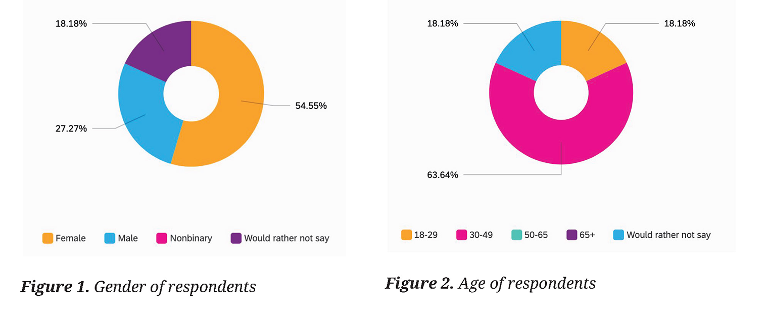
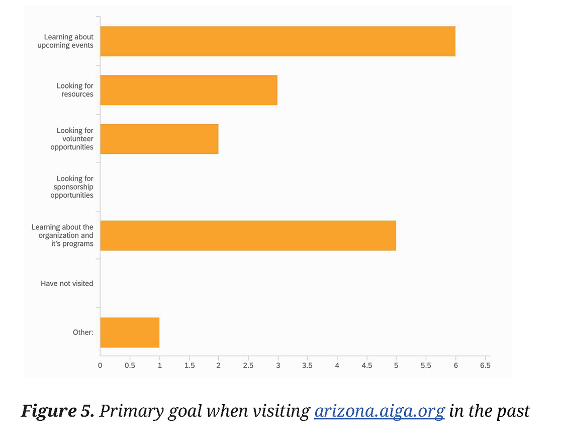
In total, there were 12 respondents — a majority of which were female (54.55%) and between the ages of 30-49 (63.64%). Respondents primarily identified themselves as graphic designers but there were a wide range of answers to the career question, showing a broad professional audience of AIGA Arizona.
The majority (63.64%) of respondents had visited the AIGA Arizona website before. The primary reasons for visiting the site was to learn about upcoming events. The second most popular reason for visiting was to learn about the organization and its programs. Three respondents selected “Looking for resources” and only two selected “Looking for volunteer opportunities.” One respondent answered with “Other,” stating, “I used to look there for job postings, but I never got the sense that it was updated super-regularly.”
- Primary goal: Learning about upcoming events
- Secondary goal: Learning about the organization and programs.
Finally, a content audit and analysis of the site revealed areas of inconsistency, broken functionality, as well as missing and outdated information.
All of the research pointed to the areas of improvement that were most critical to user experience. The Homepage needed a refresh with clearer calls-to-action and simplified navigation. Events needed to be easier to find and search through as this is the primary purpose for most users visiting the site. Finally, information about the organization needed to be clearer from a content perspective, and to be organized from a usability standpoint.

Empathize
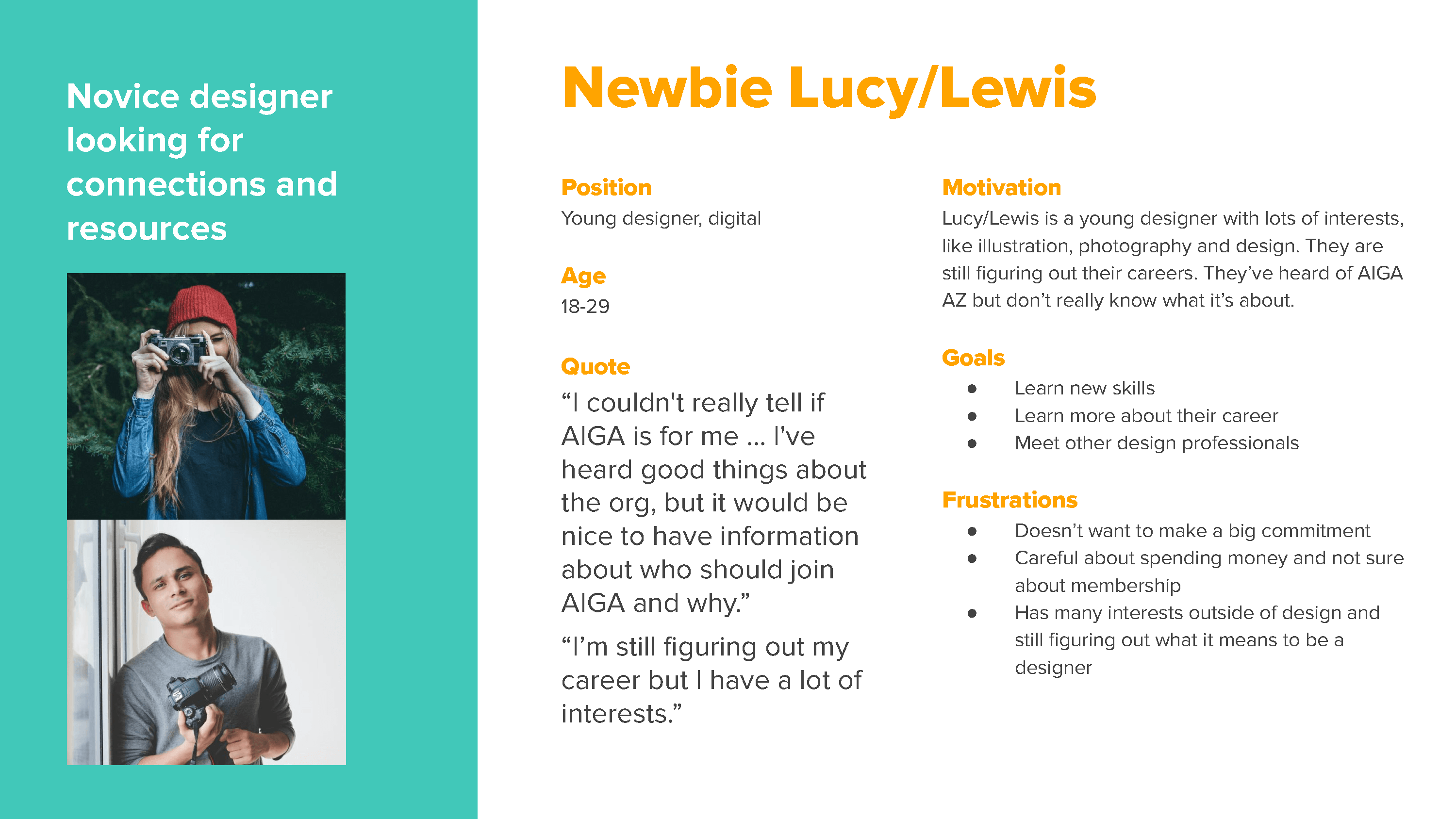
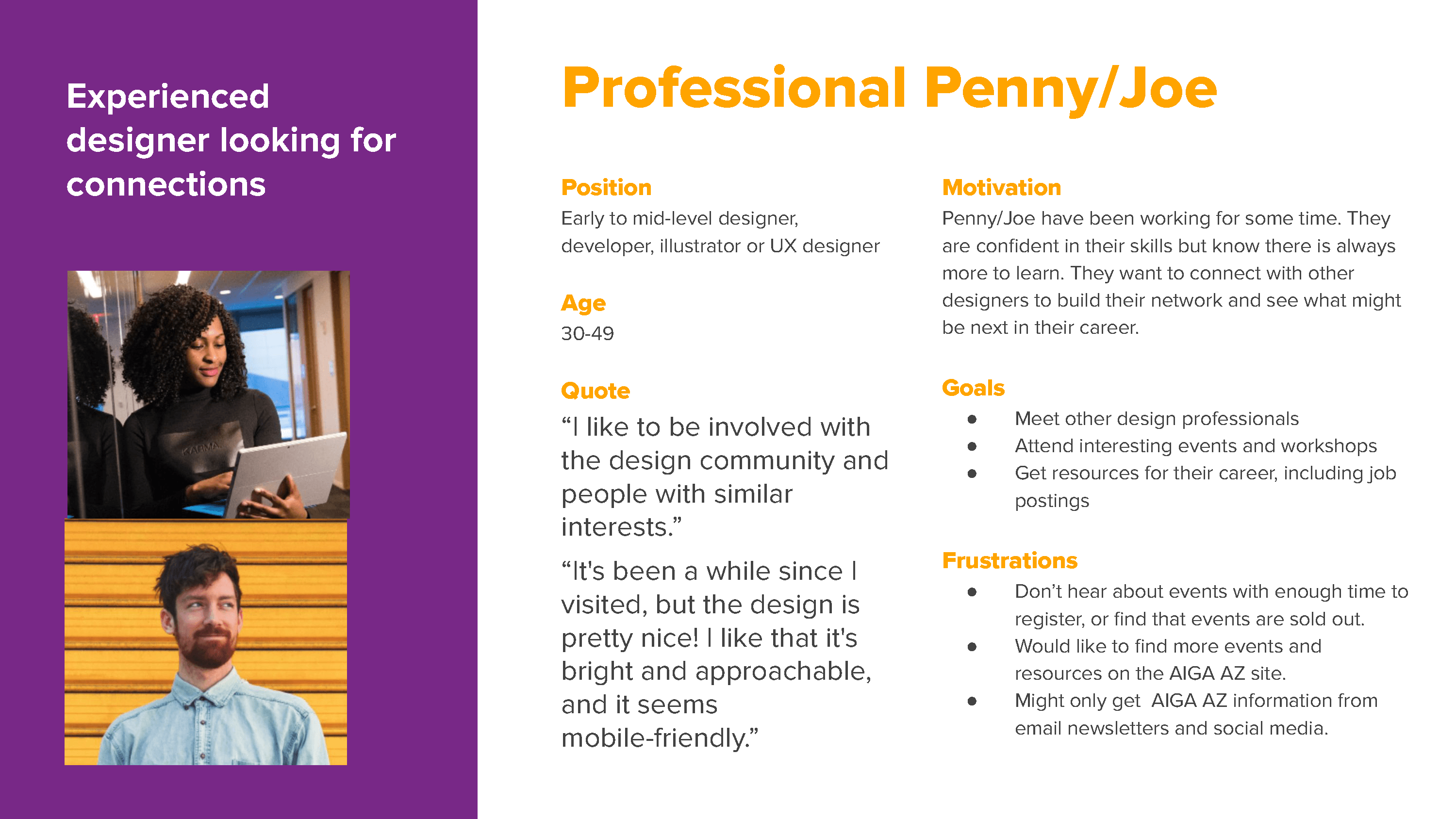
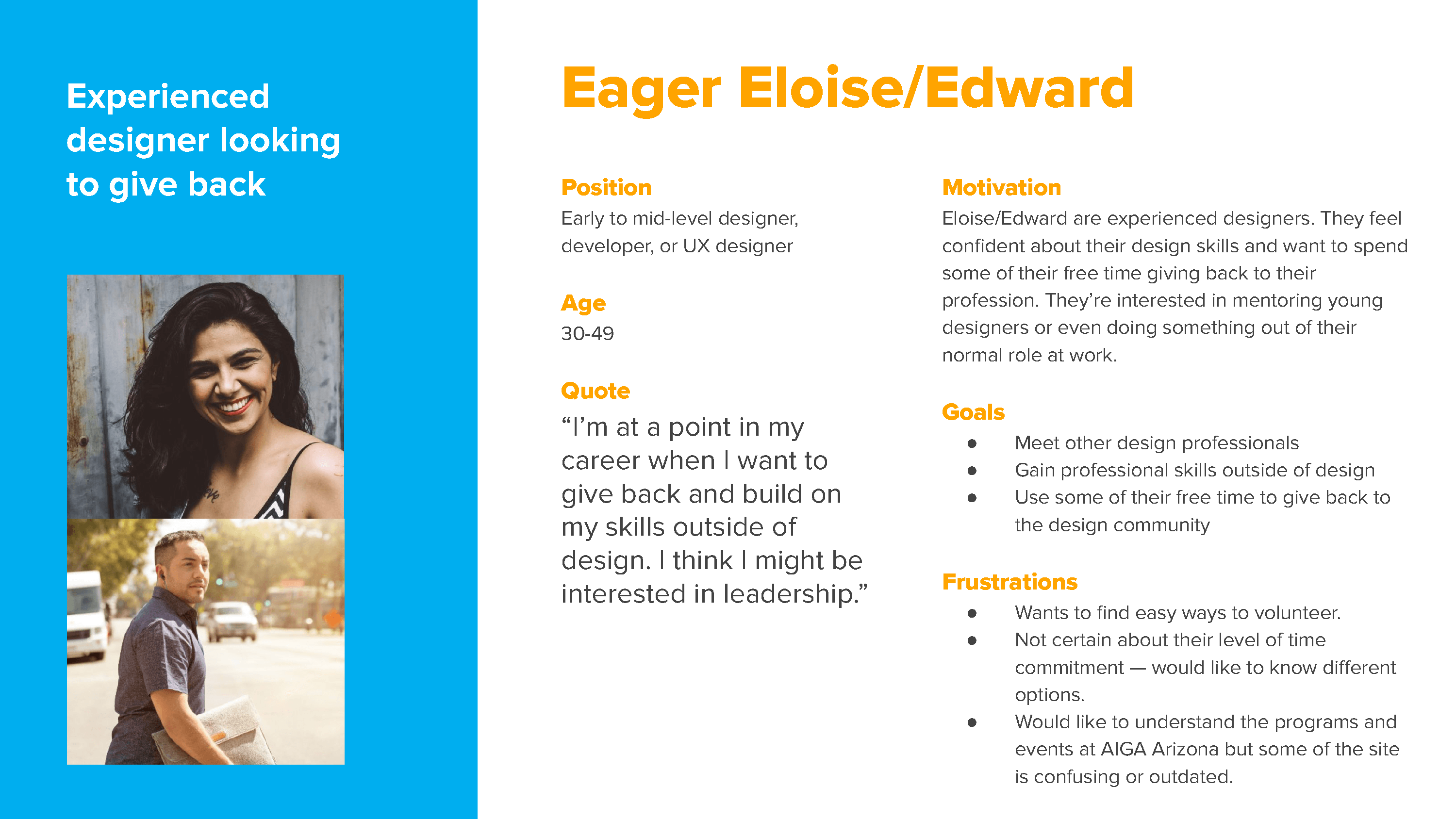
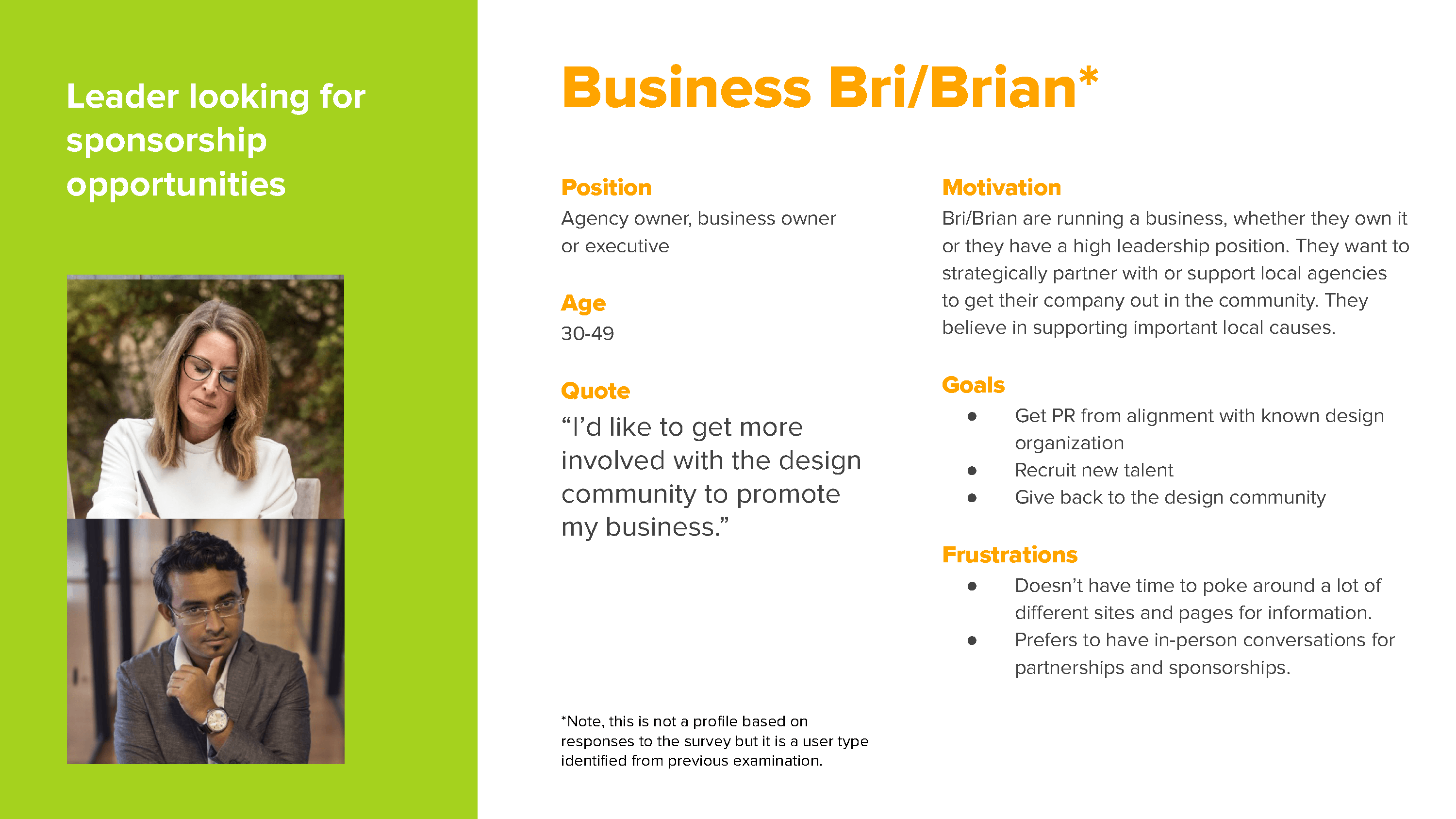
With the research in hand, it was now time to start exploring how to best improve the site for the user. Personas (PDF) were created based on the survey data as well as demographics information from the organization. Four personas were identified based on where users were in their career progression — a newly graduated designer versus a seasoned professional — as well as by their interests — building a network versus interest in volunteering of giving back to the community.
User stories (PDF) for each persona helped keep the focus on user goals when developing site features and functionality. For example:
As a new designer and site visitor I want to be able to easily sign up for events so I can get to know others in my field:
- Reduce friction in the event signup process.
- Increase transparency of event status especially in relation to sold out, or nearly sold out, events.
Testing the existing site
The next step was to test the existing site with an understanding of the audience, goals of the organization and identified shortcomings. The test was administered in person (pre-pandemic). Testing materials included a consent form, pre-test questionnaire (demographics and familiarity with AIGA Arizona and the website), scenarios and tasks to be completed by the user, a script for the test administrator, an observation sheet and a post-test questionnaire.
Five participants, all with careers in the design field and representative of the target audience, were asked to complete 12 tasks. When it came to finding general events, all participants were able to find information and registration, with an average task completion time of 21 seconds. However, when looking for events by location or topic, users struggled with site navigation, filtering and event naming conventions. “I can’t really tell which are local…I guess they all probably are?” Only 1 out of 5 participants was able to complete the task of finding a specific event.
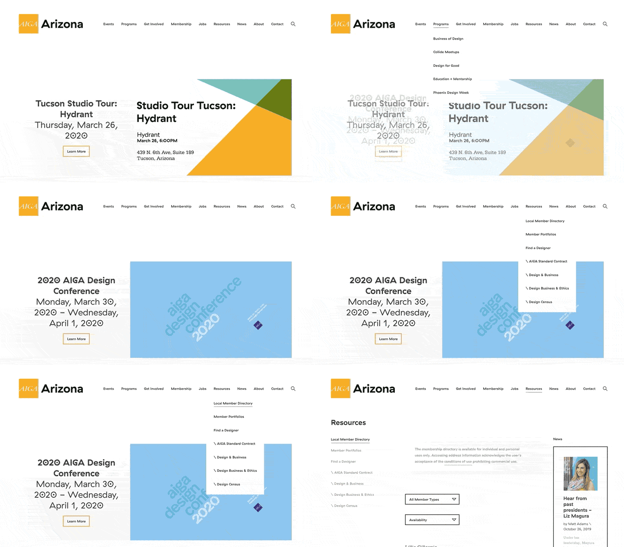
Users additionally had issues with cancelled events not being reflected on the website. This required users to click through to the event registration page before finding out they wouldn’t be able to attend. “The register button is easy to find…Oh, I clicked to register but it looks like this event is cancelled, probably due to Coronavirus.”
General information about the chapter was also difficult to find. Participants struggled with the task, taking an average of 30 seconds. Users were confused that the main “About” navigation link showed images of the full board rather than information about the chapter. “Oh, the About page takes you to information about the board. I guess I would probably want to click on ‘Mission?’” Users also struggled with getting a clear overview of the chapter’s programs and initiatives. “You can’t just click on ‘Programs.’ Weird, you would think there would be an overview.” In order to see the different initiatives, users had to click into each subpage under the “Programs” navigation. However, these pages had inconsistent levels of information page to page, many had not been updated in years and some major initiatives were missing altogether from the website.
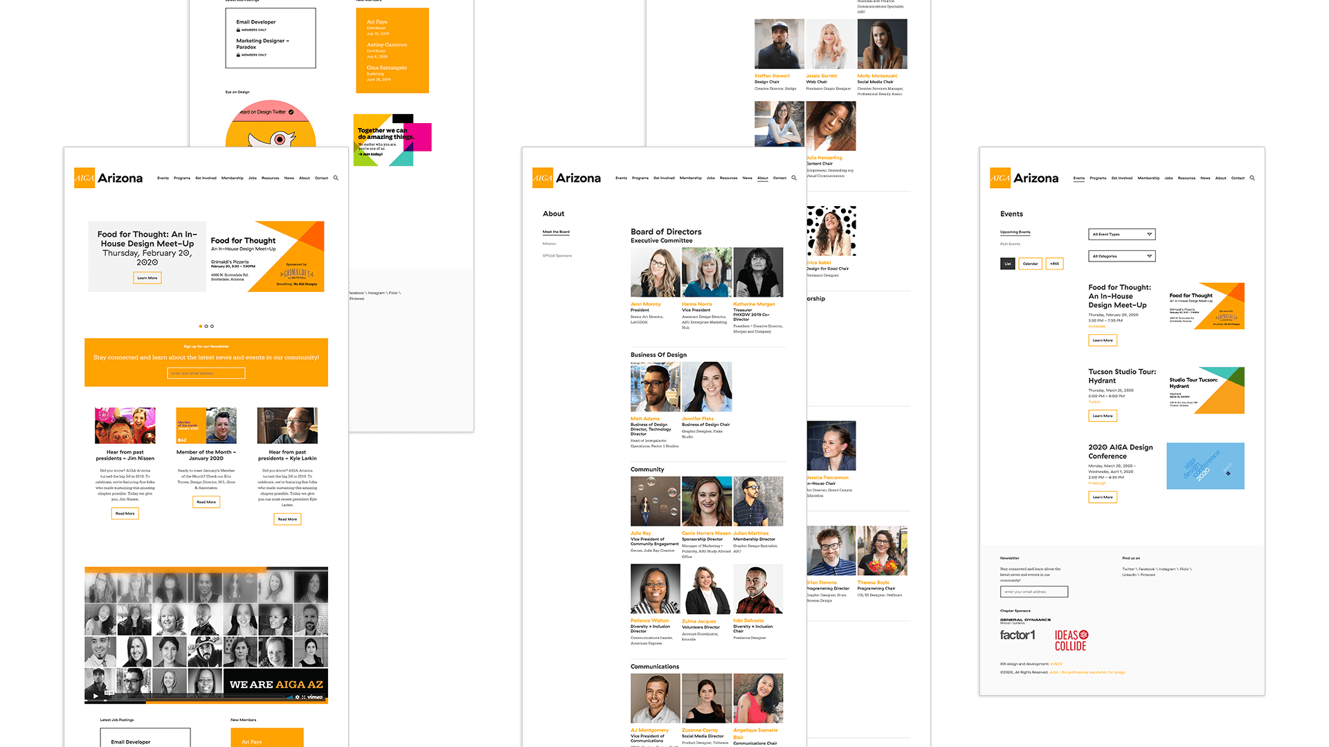
Testing was critical to understanding how users navigate the site, the thought process behind why they navigate the way they do and in identifying pain points. With this information in hand, it was now time to start prototyping solutions.
Prototype
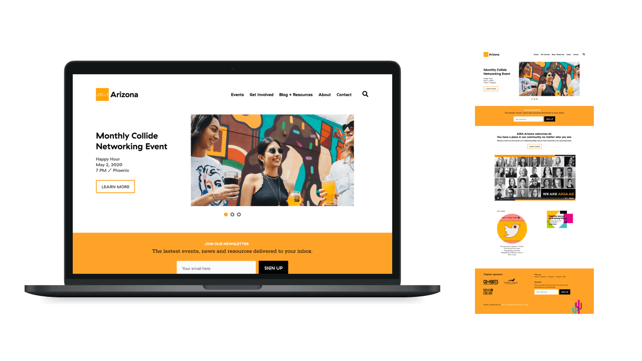
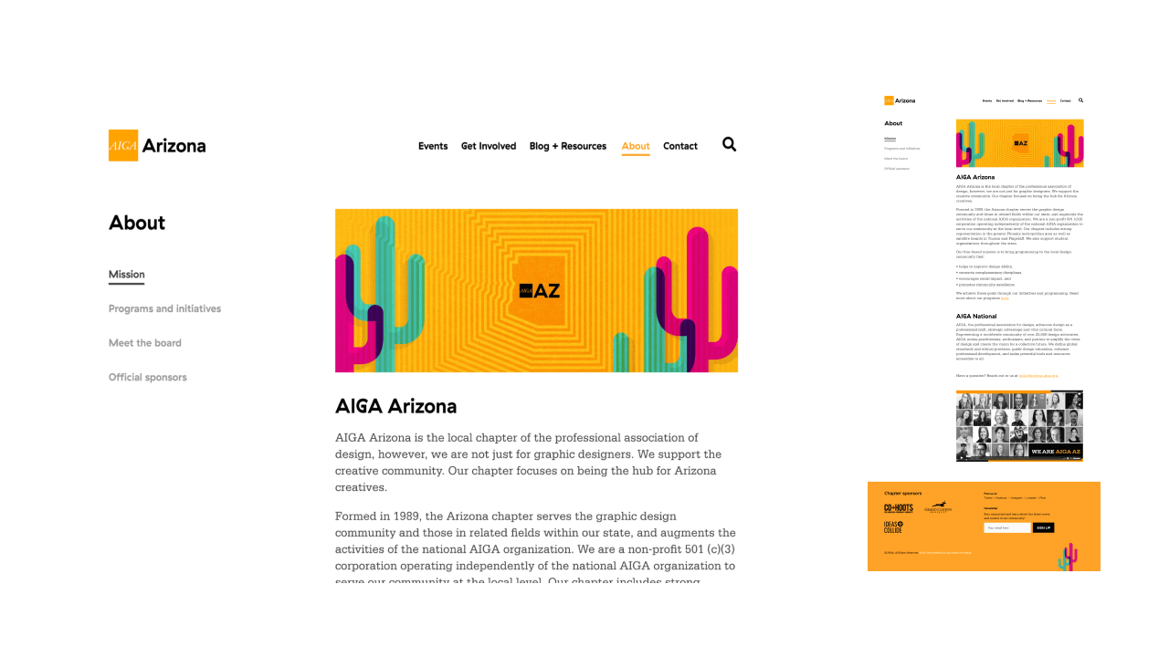
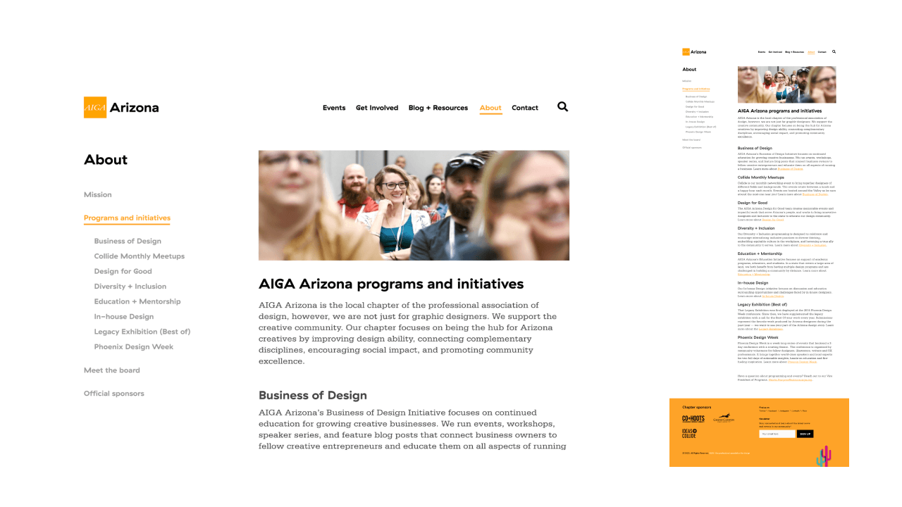
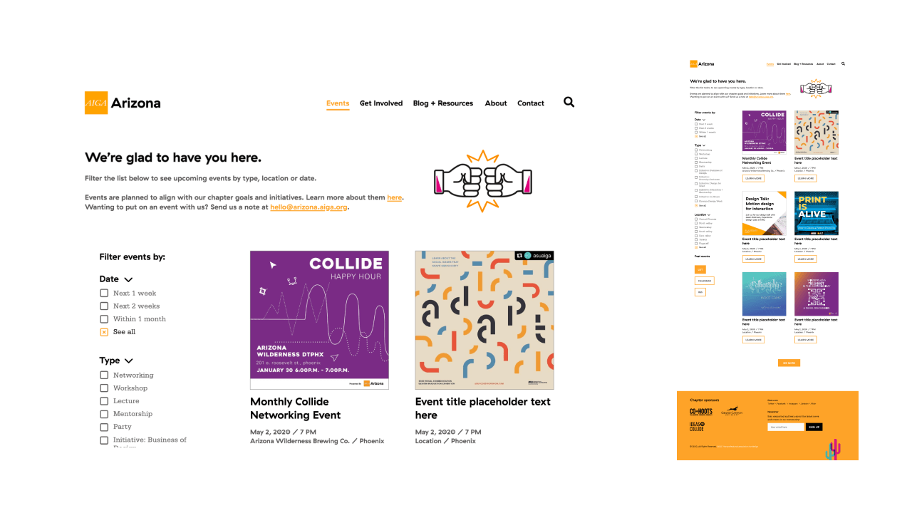
The goal of the prototype was to test small changes to the site design and structure rather than a complete visual revamp. As such, the existing branding was used. The redesign consisted of a new site plan and visual updates.
Revised site plan
The prototype solved the user navigation issues by simplifying the main navigation from 9 tabs to just 5 — Events, Get Involved, Blog + Resources, About and Contact.
Reorganizing content also helped to prioritize information and provide a better flow for the user learning more about AIGA Arizona.
- The About section was reorganized to put the mission statement and general information about the chapter at the forefront, rather than highlighting the members of the board at the top.
- Programs was moved under the About section, to give both an overview of all of the programs and initiatives, with a short blurb about each, as well as to link to the pages where users could find more information on each area.
- Membership information was consolidated into one area under Get Involved.
Resources, Jobs and News were consolidated under Blog + Resources to combine similar content.
View the original and revised site plans below, or at this link:
Visual Design Updates
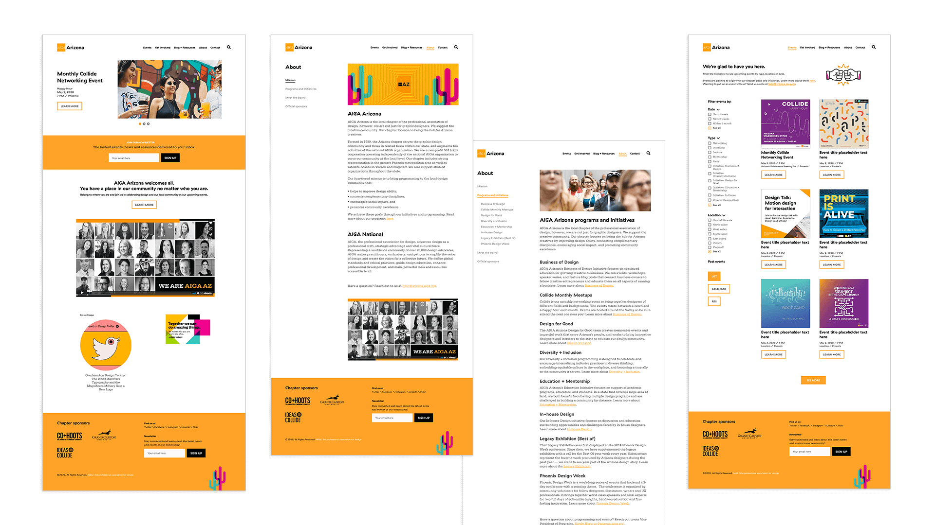
The site was further improved visually by including more photographs and graphic elements throughout.
The Homepage slider was redesigned so the event details aren't simply duplicated in the image. Following accessibility recommendations, the slider would not be animated, but rather manually progressed by the user.
The newsletter signup form was pulled up higher on the page with a bolder visual design to encourage users to sign up to stay up to date on chapter news and events. The footer was updated to a bright orange with the iconic saguaro illustrations added as a playful visual.
The Events page was updated to give users more control in filtering by date, type and location. The layout of the page was also updated to highlight more events at once.
View the prototype below, or the interactive version at this link.
Testing the prototype
The prototype was tested in the same manner as the previous test of the existing site (consent form, pre-test questionnaire, scenario testing and post-test questionnaire), however, this time the test was administered via Zoom due to the pandemic.
The user shared their screen and talked through their process while completing tasks. Zoom was beneficial due to the ability to record the session and to be able to view the participant and their actions at the same time. The pre- and post- test questionnaires were administered as Google Forms. There were two participants for the prototype test and 6 tasks for completion.
Results
Overall users found the prototype much easier to navigate than the existing site:
- Nearly 50% faster task completion
- 100% task success rate
- No major issues discovered in testing.
Recommendations
The prototype tested well and solved for some of the major issues with the site. My recommendation was to move forward with a website redesign based on prototype.
The findings were compiled into a report with usability recommendations and shared with the executive board of AIGA Arizona as well as the web dev company implementing the site redesign.
Learn more about the AIGA Arizona board:
Contact
LinkedIn: hannanorris
Instagram: @hn.de_sign
Behance: @hnorris
© Hanna Norris 2023